Today, the Internet is full of software and graphic design solutions that allow any user to turn into a graphic designer with great powers. Difficult, however, to choose from all the software massed in this market.
Some basics learning of graphics:
Here in this post, what you get to learn with the terms and bases of design, graphics and more broadly visual communication. Look no further, let’s check them.
Have a certain intention behind every visual
With each visual that you are about to create, always ask yourself this question: “What is the purpose of this graphic? “. Every graphic creation is a way to achieve a specific goal, a certain result and not an end in itself. Within the framework of a social media post, the objectives can be many. To develop its notoriety and its visibility with the help of the social networks, to invite your contacts to an event you organized, to illustrate the web site of your association or to support your collection donations using an impacting visual. As you will have understood, it is essential to define a goal well before starting any visual content.
Visual hierarchy
The principle of “visual hierarchy” is a critical concept in graphic design. Indeed, in the composition of your creation, it is necessary to pay attention to the size of the graphic elements, the use of the colours and the font of the texts. All these elements must be placed in harmony. In the same way, pay attention to the details which are also important. To overcome this pitfall, using a design grid could be an interesting solution. As a general rule, your creative should never be overloaded, be it font, colour, or message.
In short, take the concept of “hierarchy” as a guide so that people who come into contact with your creation can find the information quickly and pleasantly. And do not forget that visual communication remains an art!
Pay attention to the symbolism of colour, typography as well
And yes, each colour has its own meaning, it will not discuss in this post. Yet, it is necessary to pay attention to the use of certain colours, especially if the visual is likely to come into contact with foreign people, and whose symbolic colours are different.
In the same way, typography each have a different “personality.” For example, an italicized text will not have the same impact as a capital text. Italic letters will be reminiscent of a feminine touch, whereas bold text will refer to a masculine side. Thus, you must pay attention to the nature of your associative structure, creating visuals adapted to it.
Use graphic carefully
Of course, it does not have a well-defined and established graphic chart (colours and colour variants, fonts, logos, etc.). Colours and a logo, it’s already good. But to keep some consistency between your graphic designs and your designs, it is necessary to fit the appearance of these.
The danger of image rights
We know too little, but all the images that can be found on the internet are not reusable freely. Some yes because they are free of rights, others not because they are licensed. In this way, it is forbidden to reuse images not free of right, under pain of fines (violation of the right to the image). Thus, the type of image will determine whether you can reuse it freely or if you need to mention the author.
Attention to printing
First of all, be aware that there will always be a difference between the digital version and the printed final version. If you go by printer, be specific in your request. For example, ask that the sizes are correct, Do not hesitate to ask for any additional corrections.
Graphics software
These graphic design software will allow you to create customized visuals to help you communicate and make your association attractive to your members and potential future members.
Selections of online tools
DesignCap
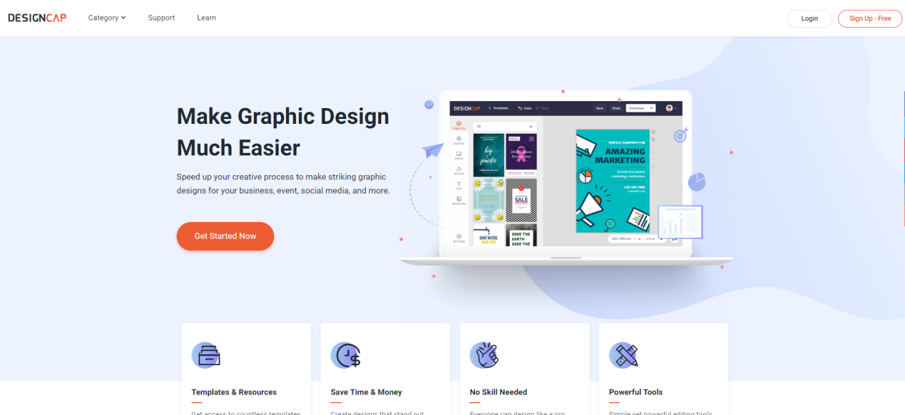
DesignCap is a graphic design tool designed for non-designer. It is a handy tool for creating graphics for social networks. Compared to traditional design software, its learning curve is relatively short. It also allows experienced graphic designers to create templates that their customers or other non-graphic people can modify in turn.
Piktochart
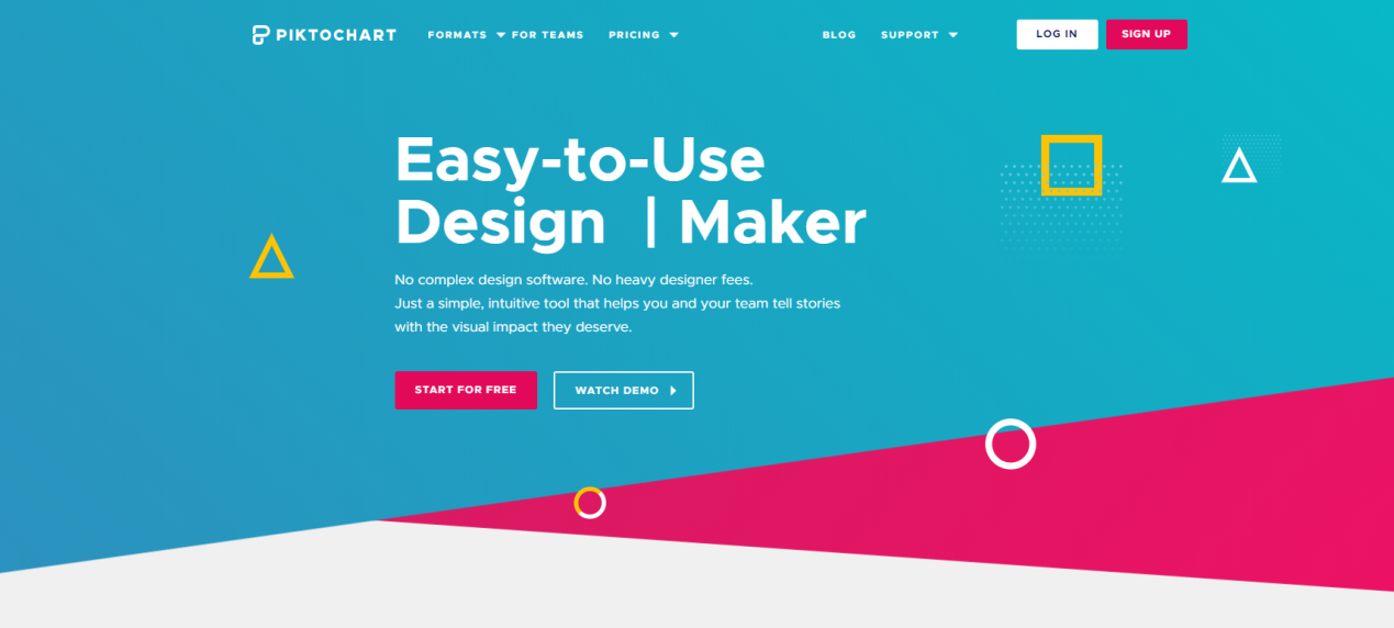
Piktochart is a tool apart because it is specialized in the creation of infographics and presentations. With Piktochart, and with a little time in front of you, creating beautiful designs becomes a child’s play. Very easy to use, the online tool also offers something to create flyers, posters and social media.
Canva
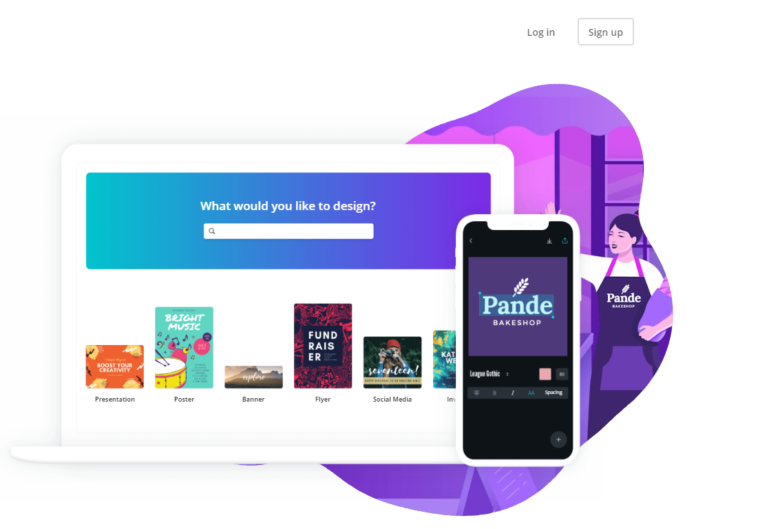
This is the most known tool and the most used by internet users! Canva offers, through a free version and a premium version, a tool with full features: flyers, blog visuals, infographics, website banners, newsletters and even invitation cards. An infinite number of possibilities and all made to measure!
Design Wizard:
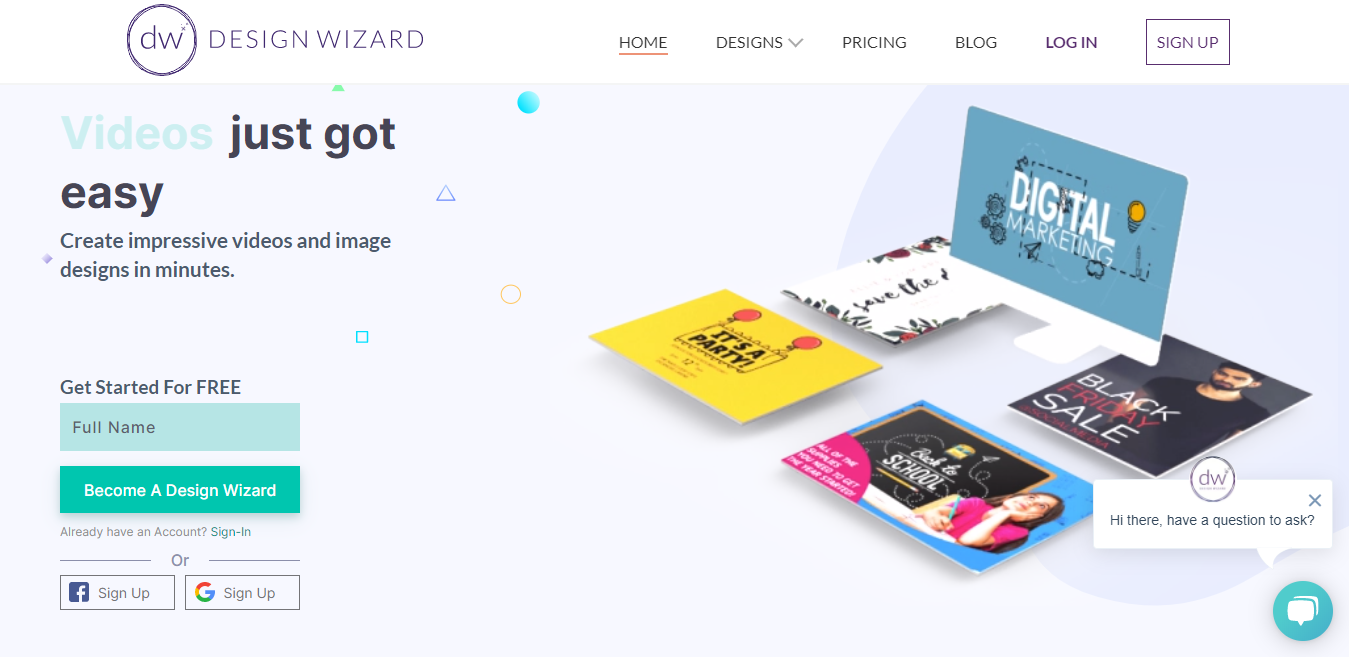
The last and the best tool for Social Media Manager is the new Design Wizard which is also termed as an all-in-one marketing tool. The new Design Wizard app helps to not only make images design but also make impressive video ads on the go. Not just that it also gets really unique content creation tool. Think Canva, Promo and Shutterstock all on the one platform. This is what you get with Design Wizard:
- An easy-to-use image editor + premium template library
- An easy-to-use video editor + premium template library
- Free video and image stock website – completely copyright free
Placeit:
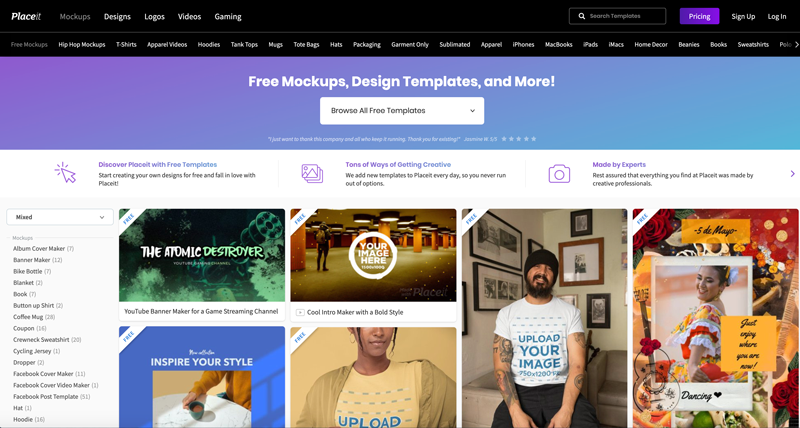
The last website for making great graphic design is from popular Theme maker Evanto with the new Palceit. The new Placeit website also provides free marketing templates that one can use without any issues on their blog or websites. One can even allow you to create logos, images, videos, and mockups. Do try it for great experience.


